Just Post Imp

Just Post Imp- also known as "Post Project" during development
Just Post Imp was the product of three consecutive years at university studying 2d animation, and is a student film.
The premise was conceived the previous year before its creation, based on the whimsical notion that any given time parcels or mail turn up late, damaged or in sub-par quality it’s because imps work in the parcel depot. From here the idea developed to focus on a singular imp and his journey to deliver a parcel, despite the other imps’ antics.
Animation Tests
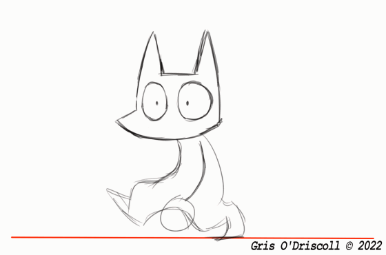
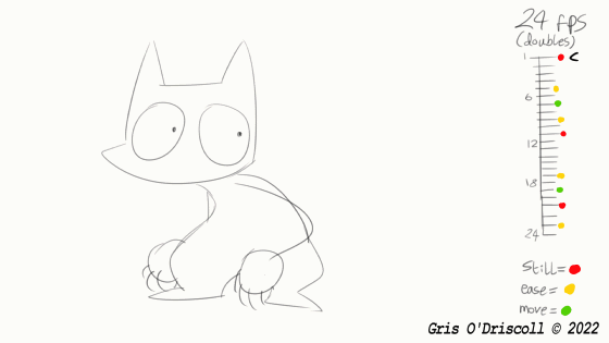
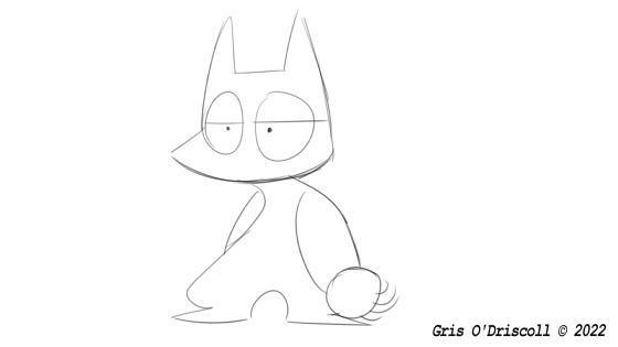
Various animation tests- the walk cycle was a design functionality test. The two tests below it were created after studying the character movement from a particular animated show called “Jelly Jamm”. I wanted the non-protagonist imps to be animated in a sort of fast-paced, moves-without-warning way which I have less experience with, in comparison to the protagonist imp who would move with more flow to their movements. As such, Jelly Jamm was a good focus of study given characters are all animated in that sporatic way I wanted to emulate. I noted after studying frame-by-frame that said show uses no smear frames and minimal inbetweens beyond a subtle ease-in and ease-out, all between large jumps in movement. With my own tests I forwent smear frames entirely, though I did retain some inbetweens.
In the final animation project itself, it’s an unfortunate fact that one can’t tell that the imps are animated differently from each other. Regardless, I still consider my studies on the imps’ movements important to at least my development of creating character animations. In future projects I am sure that I will be more successful with my attempts when it comes to adding variety to movement beyond what I’m used to.
Concept Art

This column features the concept art, like the title suggests. The image above is the original art to get a feel for what the animation is about, setting a scene as it were. One of the earliest images created for the project, before the imp design was finalised.

An art direction test. I knew from early on that I wanted the animation to be weaved into the theme of parcels and letters using the art direction. The straightfoward way to do that, to me, being to scan in brown paper, envelopes, plastic delivery packets and other goods that people associate with postage. The scanned resources were then used as backgrounds, with the animations of the characters drawn over the top. This also doubled as providing a charming tactile feel to the animation in my opinion.
Mildly interesting tidbit about the boat drawing featured- before the script was completed there was originally an idea for a scene that involved the protagonist having to board a ship and travel across the ocean, parcel in hand. This idea was kept around for the longest time during pre-production before being cut outright. If the scene were to have made it into the final animation I would have animated the waves that are featured in this very art. The waves themselves are created from a sheet of blue card with ripped brown paper resting directly on top, and they would have been animated by switching out the paper for various other ripped pieces.

Final test with the art direction, an alternative where the background is made from pre-digitised images of packaging textures, just in case for any reason I couldn’t just scan my own textures.


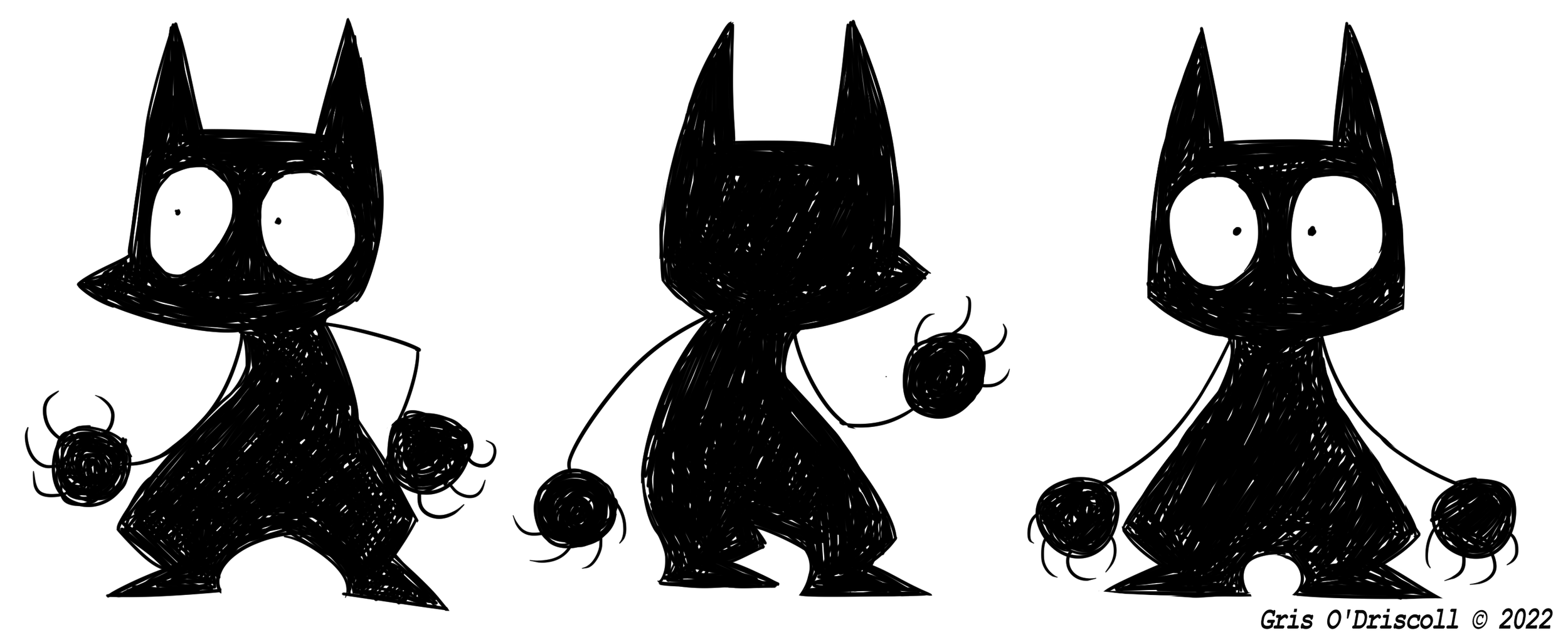
The imps themselves went through a few different design iterations though were always decidedly going to have black (or very dark) bodies with wide, alert eyes. The look of them are inspired by a mix between centuries old depictions of imps being diminutive, black figures and the soot sprite characters featured in a few of the Studio Ghibli films. The design of the imps were pretty quickly finalised though it took a bit longer to decide whether to draw them with a sketchy scribble body texture or as plain black.
One of the concept art (non-final) designs also made a surprise appearance in the animation- kudos if you noticed before reading this.